
Unified Access for Bosch GS Teams
From scattered systems to a unified dashboard experience for internal efficiency.
Dashboard Design | Internal Tool | Enterprise UX

Clients
Bosch Global Service
(Financial Operations Team)
Team
1 Product Manager
2 Designers
2 Developers
Responsibilities
User Research
UX Design
Usability Testing
Duration
3 Months
Jan - Apr, 2022
Tools
Figma
Business Strategy
Since 2022, as Bosch’s business scaled post-COVID, the number of stakeholders has expanded—from internal teams to external collaborators.
Without a unified process or entry point, tracking updates and accessing key information has become increasingly difficult, leading to inefficiencies and misalignment across teams.
User Expand

As Bosch scaled in past 3 years, teams grew rapidly, but systems didn’t.
179
New Users
0
unified process
2020
2021
2022
Problem Statement
Financial staff are forced to jump between multiple web pages and tools every day, and the scattered entry points seriously slow down work efficiency
The lack of a centralized entry point makes it difficult for employees to find critical files, updates, and tools.
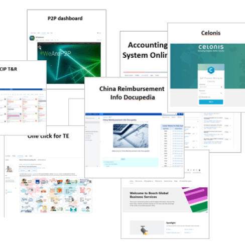
Services
Emails
Chats
Cloud Drive
Cloud Drive

A fragmented start to the day: too many platforms, too many clicks.
5 sec to response
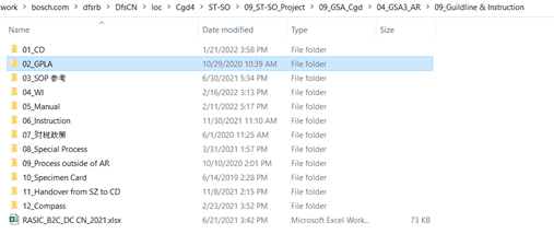
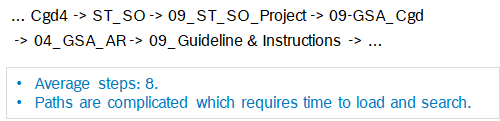
Tier 1: 11 files to navigate
Tier 2: 22 Files to navigate
6.5
Steps(Average)
Low Efficiency
Solution
Design an intuitive entry point that reduces navigation effort and enables OSP & OBC teams to quickly access the tools and information they need?
Left Navigation Tabs
Consolidates key entry points (Platforms, Documents, Communities) to reduce scattered bookmarks and improve daily workflow efficiency.
Platform Cards with Logos
Visual logos paired with concise descriptions support quick recognition of frequently used tools.
Documentation Cards
Shows file type, update date, and read/unread status—helping users prioritize what’s new without opening every file.
Clear visual cues improve scannability. Greyed-out “Read” status minimizes distraction while preserving context.
Community Cards
Designed for engagement and visibility—helps users discover and access internal networks through recognizable visuals.
Impact
We made employees feel more in control of their workday
Onboarding Time
Adoption Rate
User Satisfaction
Efficiency
Impact
Low
Before
After
↑54%
speeds up
3.2 / 5
↑ 4.6
4.6/5 satisfaction
↑ 50%
daily active users
Siloed usage by teams
↓3
Cut to 3 days
2 weeks to get used to tools
Clients
Our primary stakeholders are the finance teams responsible for managing outgoing & incoming payments
$
Outgoing Service Provider
$
Incoming Service Provider
Shared Tool Ecosystem
Even though their roles differ, the tools and systems they use are largely the same
Microsoft Outlook
SAP(ERP)
SharePoint / OneDrive / Teams
ServiceNow
Celonis
User Pain Points
10 user interviews revealed that scattered platforms and repetitive navigation are major sources of inefficiency.
“A year wasted in clicks”

Onboarding and file searching add up to 6 lost workdays per year
“I can never remember where things are”
Ambiguous categories make locating the right file frustrating
“It takes too long to find and open the right file”
Deep folder paths force users to click through at least 5 layers to reach a file
Persona
Finance teams struggle with scattered tools and delays, needing a unified, intuitive hub to streamline daily workflows

Pain Points
Too many disconnected tools
Confusing where to find the right resources
Delayed communication across teams
Quick access to all tools and documents
Centralized communication
Expectation
Problem Statement
Too many scattered platforms and links force employees to spend excessive time finding the right tools, slowing down daily work and collaboration
Inefficient document retrieval
Extra communication efforts
Lack of visibility on recent updates
HOW MIGHT WE
How might we give finance teams a single entry point to work faster and more efficiently?

research question
1: How to Identify the categories
Card sorting helped me understand how users naturally group their daily tools, which led to a clean structure of Platforms, Documents, and Communities for easier access.
Inputs
Commonly Used Resources

Classify
Resources into categories


Output
Three Categories
Platforms
Documents
Communities

Content Volume Audited, based on how users group tools. We audited current content, and accounted for future scalability
Platform
6
Platform
50+
Communities
research question
1: How to show the categories
We chose a vertical tab layout to allow scalable growth for future categories, while matching users’ natural habit of scanning content top-to-bottom
Pros
Handles many categories or nested items well; ideal for complex systems with deep hierarchy
Cons
Consumes horizontal screen space
Like in Google Drive
Pros
Ideal for fewer categories: Works well when there are 3–6 top-level items.
Cons
Less scalable with more than 3–4 tabs
Risk of content being hidden or nested
Vertical Tabs (Left Navigation)

Horizontal Tabs (Top Navigation)

research question
2: How to Design Entry Cards for Quick Recognition and Action
Evaluating Card Designs to Identify the Most Effective Format
Platform Design

Platform Card design
Choosing Icons and Annotations for Visual Consistency and Faster Onboarding
Pros
Straightforward and space-efficient layout
Cons
Lacks visual identity (e.g., logos or color cues)
Sample 1: basic Info
Celonis
sAP process mining by celonis
Pros
Enhances visual recognition and brand association
Cons
Not all platforms may have clear or consistent branding assets
Sample 2: With Logo(Horizontal)

Celonis
sAP process mining by celonis
Cons
Vertical layout takes up more height, limiting how many cards fit per row
Cons
Increased vertical space usage
May distract from core information
Sample 4: With image

Celonis
sAP process mining by celonis

Celonis
sAP process ...
Sample 3: With Logo(Vertical)
Celonis
sAP process mining by celonis
Celonis
sAP process mining by celonis
Documentation Design

Documentation Card design
To maintain consistency with the platform layout, we added read status and file owner avatars to help users quickly locate needed files, while update status subtly alerts them to recent changes
Sample 1: File name+ Update date
Documentation name
Update on Mar. 4th 2022
Documentation name
Update on Mar. 4th 2022
Pros
Helping users quickly identify the most recent and relevant documents
Sample 2: File name + Description
Documentation name
Description goes here.
Documentation name
Description goes here.
Cons
Frequently updated files would require regular manual updates to keep descriptions accurate
Sample 3: Show the checking status
Unread
Site name
Description goes here

Last updated on Mar.4th 2022
Read
Site name
Description goes here
Last updated on Mar.4th 2022
Site name
Last updated on Mar.4th 2022
Site name
Last updated on Mar.4th 2022
Pros
Shows owner, helping collaborators identify responsible teams or projects
Adds read/unread status, guiding users to the most relevant or new files
Cons
Too much metadata may overwhelm users
Color indicators for status may confuse users (e.g., green ≠ “to view”, red ≠ “unviewed”)
Site name
Last updated on Mar.4th 2022
Unread
Site name
Last updated on Mar.4th 2022
Pros
Status color alone may confuse users (e.g., green/red implies urgency or action)
Read
Sample 4: Show the cooperation people & File owner
Pros
Shows file owner build transparency
Cons
Adds cooperation may make the layout feel cluttered
Showing description requires more attention to alignment for consistency
Last updated on Mar.4th 2022


...
Site name
Description goes here
...
Description goes here.
Site name
Last updated on Mar.4th 2022
Sample 5: Show file images

Pros
Provides visual context at a glance
Cons
Limiting how many items fit per screen
Community Design

Community Card design
Although the layout differs from Documentation and Platform, we incorporated member photos to add warmth and a human touch to the design
Pros
Provides visual context at a glance
Cons
Limiting how many items fit per screen
Sample 1: Images

Community name
Description goes here.
Reflection
Designing with Internal Employees, Not for Them
Our target users were Bosch internal finance associates. Initially, user research was seen as “optional” and non-essential. Some employees were hesitant to participate, worried it would interrupt their routine or add to their workload.
Design Insight:
I realized our biggest risk wasn’t a bad interface—it was lack of adoption. If employees didn’t feel ownership, they wouldn’t use the tool, no matter how "clean" it looked.
How I Tackled It:
Instead of treating research as a one-time phase, I reframed users as co-creators. I scheduled quick opt-in feedback loops during their workflow transitions, and shared early sketches for input before making assumptions. This shift built trust and ownership, and later made usability testing feel natural, not performative.
Result:
70% of participants opted in again for follow-up testing. One stakeholder said, “It feels like this tool understands how we really work.”
Sense of Belonging
Reflection
Bridging the Language Gap Between Design and Engineering
Many pain points shared by users were qualitative, vague, and embedded in internal jargon (“it’s too messy” or “feels buried”). Meanwhile, developers were focused on backend feasibility and maintaining clean data structures.
Tension:
There was a disconnect between lived user experience and implementable features. Our team risked building something functionally correct but behaviorally irrelevant.
My Role:
I stepped in to create user scenarios and annotated wireflows, mapping user frustrations to system touchpoints (e.g., “takes too long” = 4 navigation layers to get to a frequently used file). I also hosted a “walkthrough hour” where devs watched task completion live with users—turning abstract complaints into observable friction.
Impact:
Engineers started proactively asking about interaction intent, and we aligned on a new documentation structure with fewer assumptions baked in.
Translation, Not Just Communication
Contact Me
Site Map

Got a challenge?
I’m ready to design the solution